

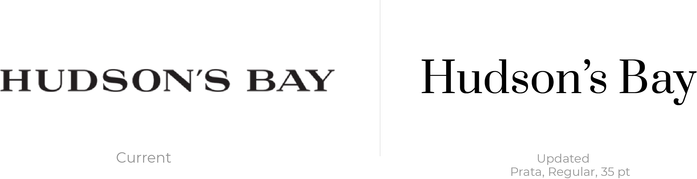
Word Mark
To begin the project, I wanted to update the Hudson's Bay wordmark which is used without the logo on the website. I wanted to maintain a serif font to preserve the website's identity.
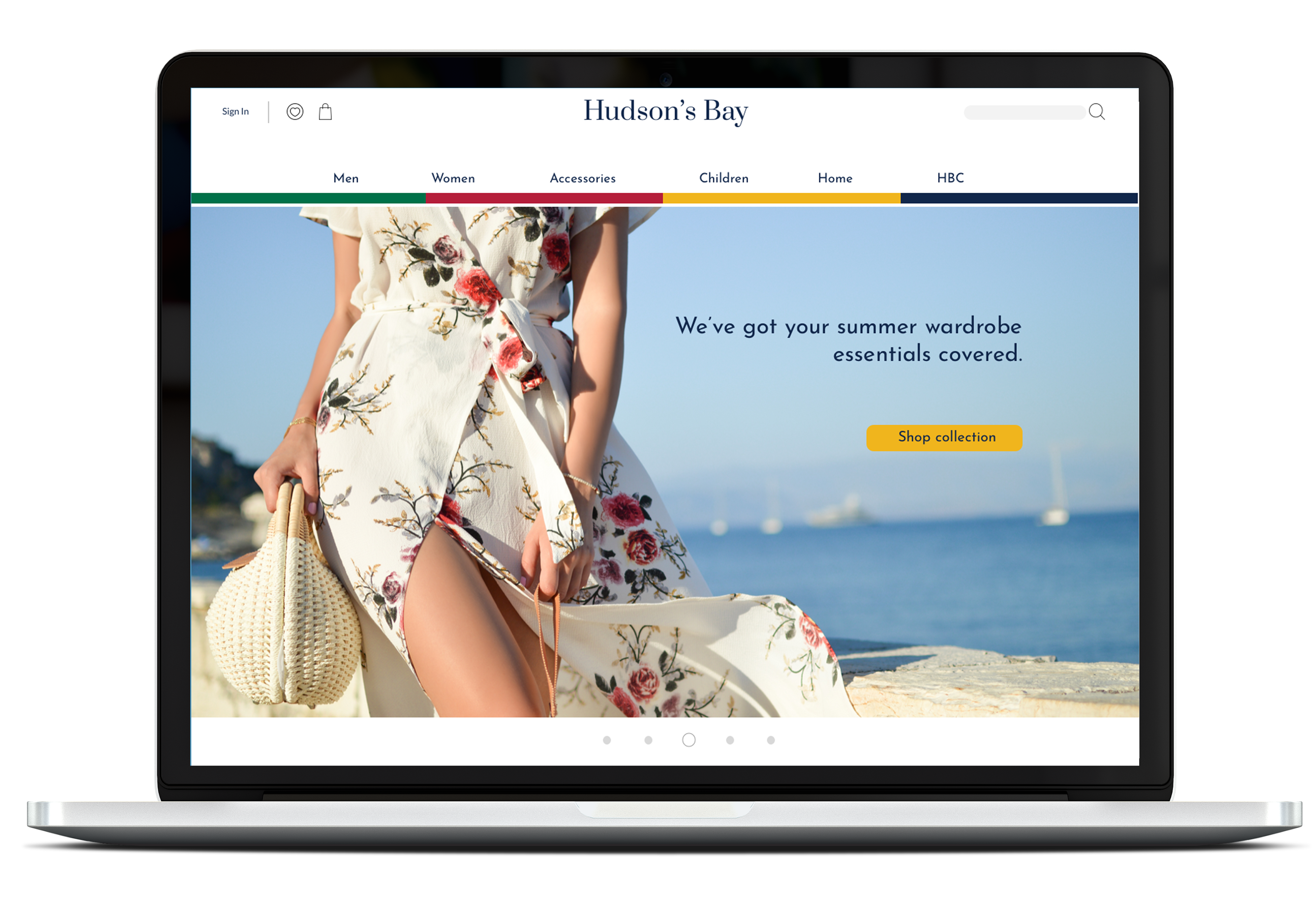
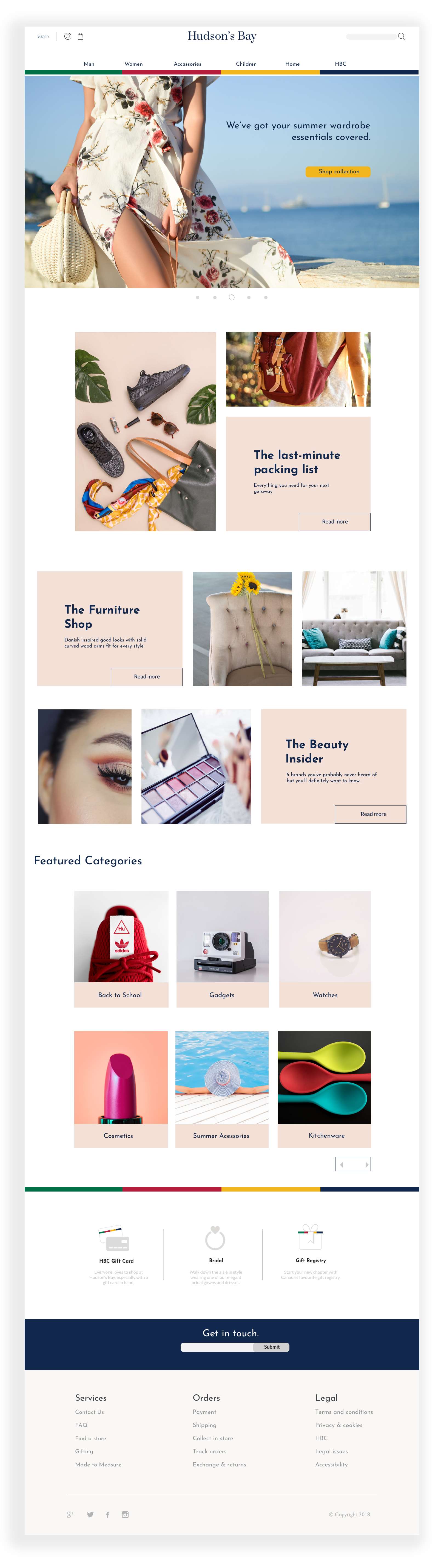
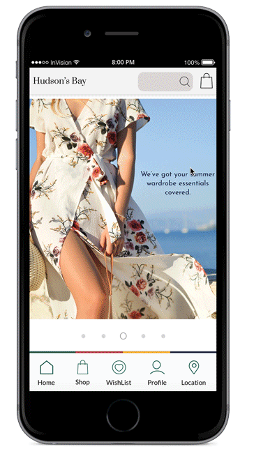
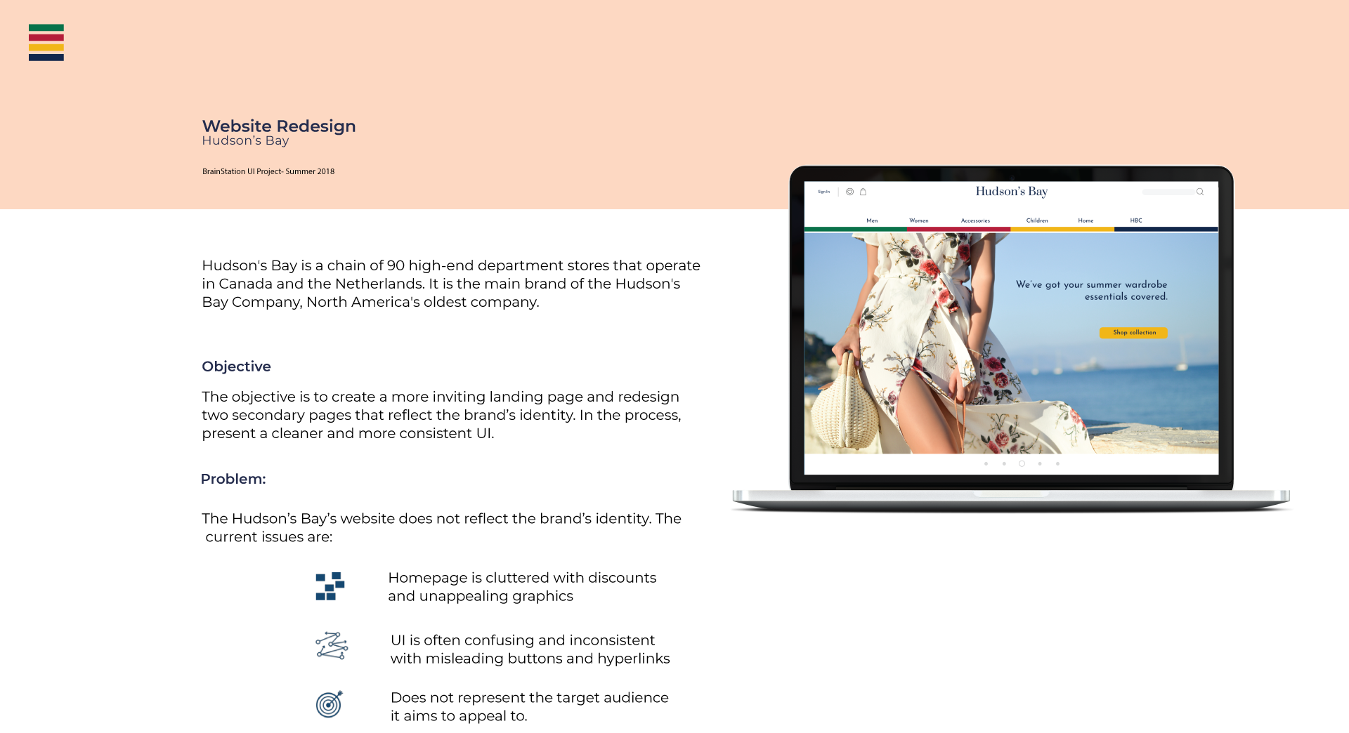
Landing Page
I designed the landing page with the user in mind. For a more personalized experience, I wanted to allow the user to navigate freely to pages that they were interested in as oppose to being overwhelmed with the content in the Homepage. For my navigation (Menu bar in Desktop, Bottom Nav in mobile) I wanted to incorporate the iconic Hudson's Bay colours to reflect the brand's distinct character.
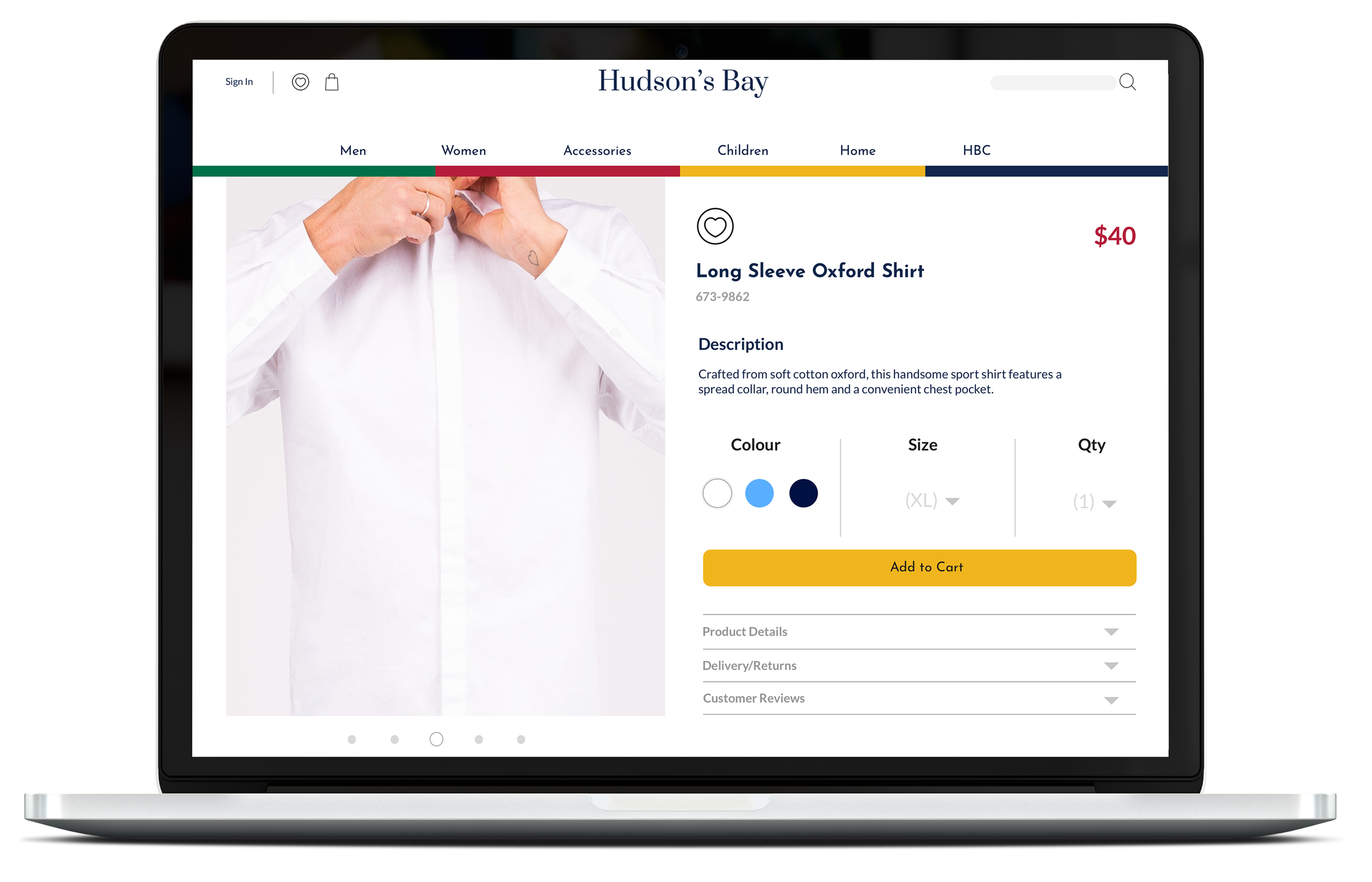
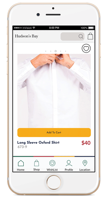
Product Detailed View
When designing the PDV page, I wanted to give the most real estate to the product viewed. I wanted the primary focus to be on the product with all other elements being secondary. The mobile version followed this concept with the product image taking up most of the space above the fold.
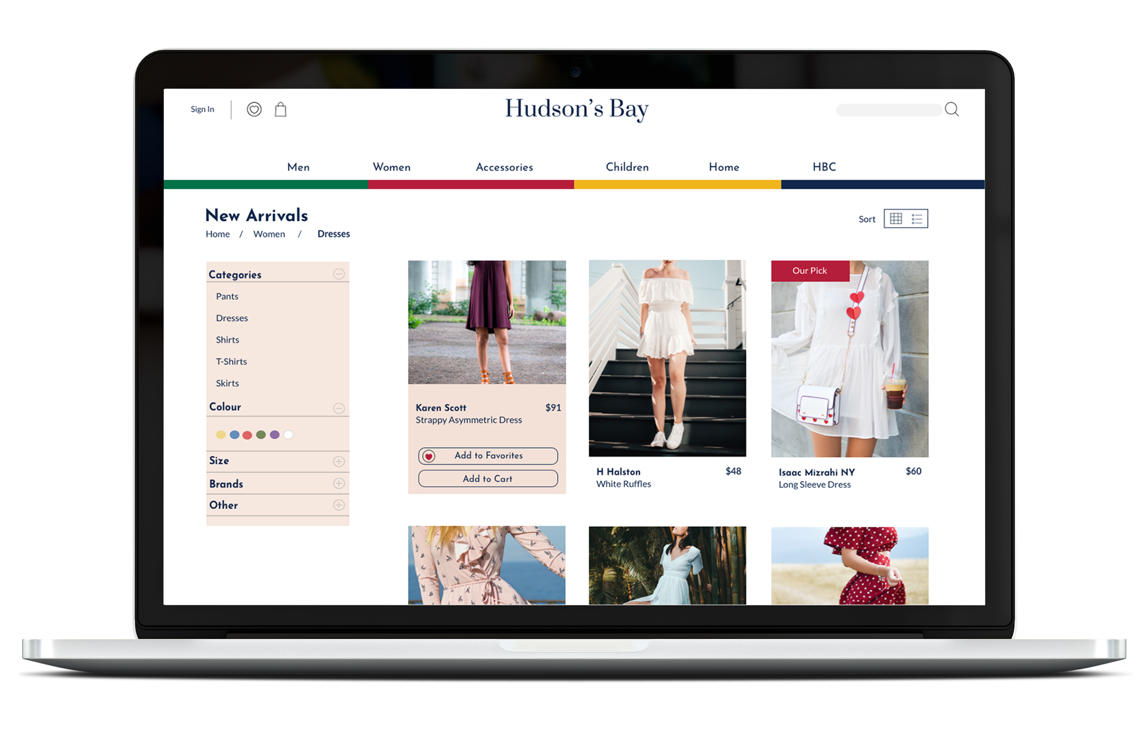
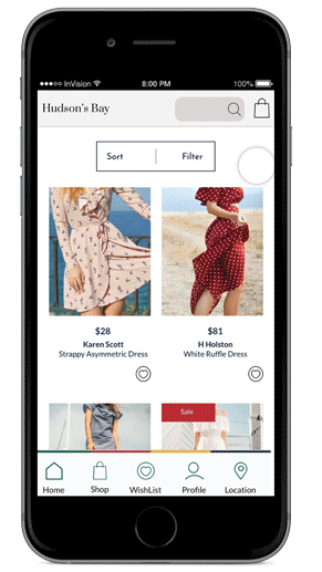
Product Page
This page was designed to allow users to scroll freely through products with the possibility of filtering out results and favouriting items to view later. The mobile version follows the same concept.
Thank you for viewing